Aurora
Branding and Marketing
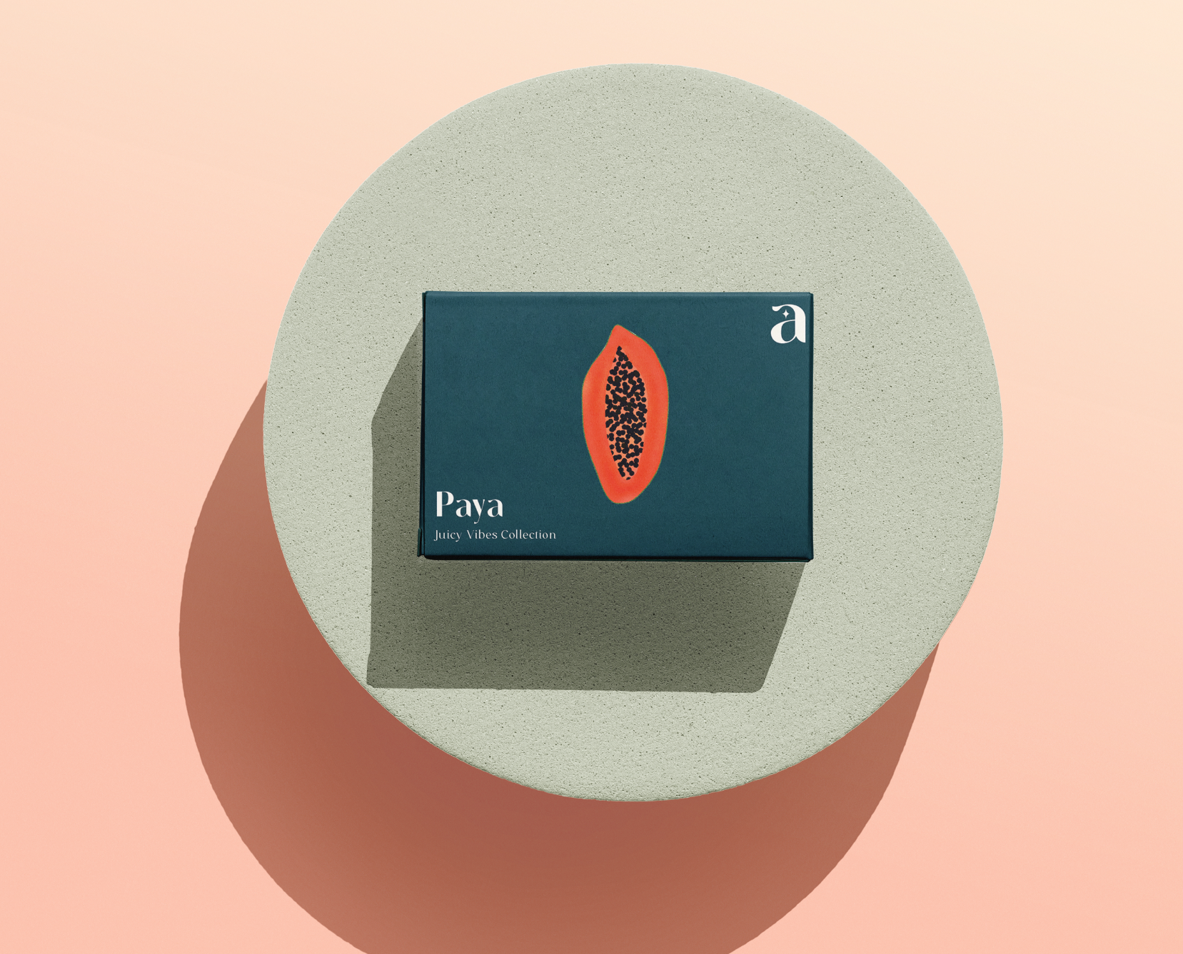
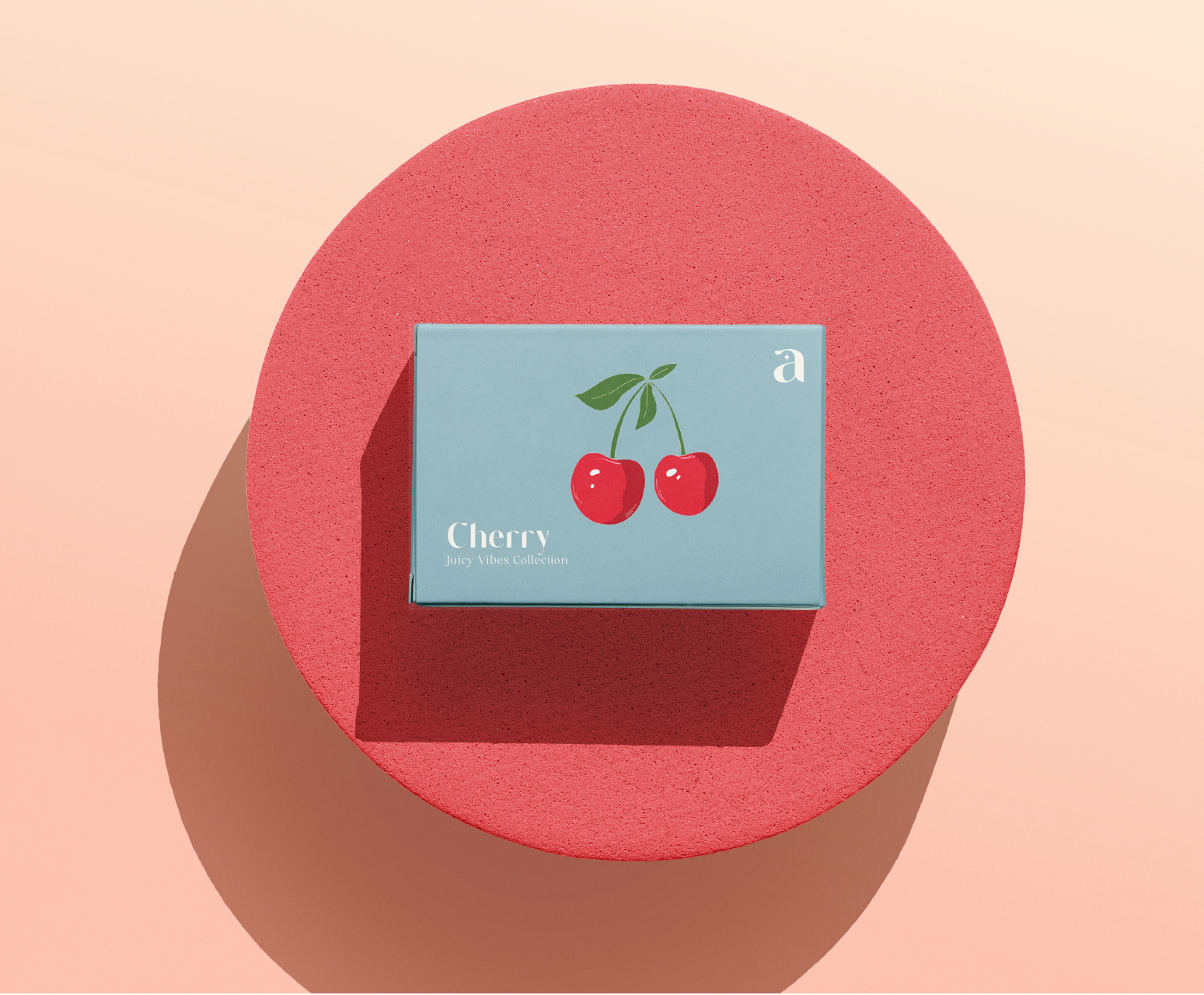
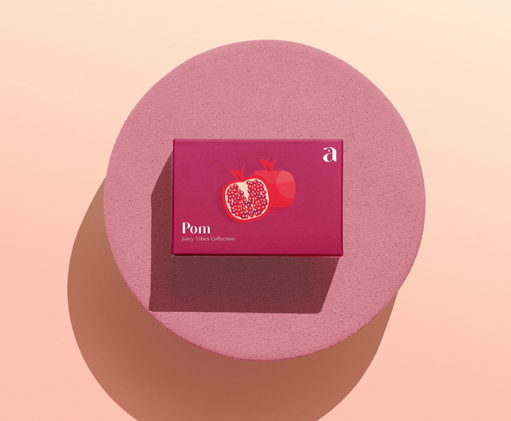
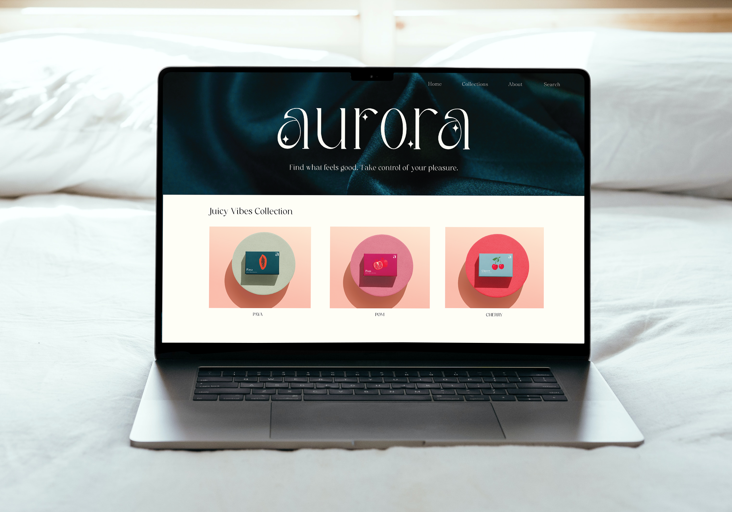
The challenge for the Aurora brand project was to create an elegant and nuanced identity for a woman-owned company that celebrates sensuality and empowerment. Incorporating fruit names for the products added a layer of intrigue and playfulness to the brand’s personality. To capture the essence of Aurora, I embarked on a journey of exploration into feminine sensuality and empowerment. Drawing inspiration from the natural world, I explored various fruit motifs to symbolize the diverse range of experiences and sensations associated with pleasure. Through a process of iteration and refinement, I crafted a visual language that balances sophistication with playfulness, incorporating elegant typography and subtle fruit-inspired elements to evoke a sense of luxury and delight.
The result is a beautifully crafted brand identity that celebrates femininity, sensuality, and empowerment. The use of fruit names for the products adds a whimsical touch, inviting customers to explore and embrace their desires with confidence and joy. With its elegant aesthetics and nuanced messaging, Aurora stands out as a beacon of sophistication and pleasure in the world of intimate wellness.
